Tuesday, February 23, 2021

 Simon Says Stamp Wednesday Challenge


I decided to enter a little friendly competition over at Simon Says Stamps.

This week the challenge is "Your Favorite Technique." Ink blending is my favorite technique hands down.  My favorite ink blending technique is stamp and smudge.  

In this example I used Distress Oxides.  The sundial is stamped then blended in Dried Marigold, the jellyfish is stamped then blended in Mermaid Lagoon, the greenery is stamped and then blended in Iced Spruce.  

I die cut the sea plants out of colored card stock.  

I ink blended on some white card stock then stamped the fish over the blending. I then fussy cut the fish and fully embossed it with Ranger Kitsch Flamingo embossing glaze.  

I stamped the sentiment then embossed it with WOW Silver embossing powder over black ink and then again with Peacock Feathers embossing glaze.  

I used black cardstock for the base and embossed the edges with some glittery embossing powder.  

I raised the panel with some fun foam and glued it down then raised the fish on some foam strips and added it in. 

Finally, I embellished it with some clear round pearls and some Nuvo drops.  

I hope you like it!

Monday, February 22, 2021


Exploring Alcohol Ink
Got out my Alcohol inks today since it was warm enough outside to have the window cracked.  This was Play 1. I used just two colors of ink here and it's done on Cricut Vinyl (I was out of Yupo, again.) Creating these backgrounds is so addicting.  Here I used Espresso and Citrus.  The method. Drop some ink, drop some 91% Isopropyl Alcohol and use a special tool to blow/guide the ink.

There is only one way I could teach this and that would be video.  Never two come out the same. Alcohol ink tends to have its own path. Embrace it.


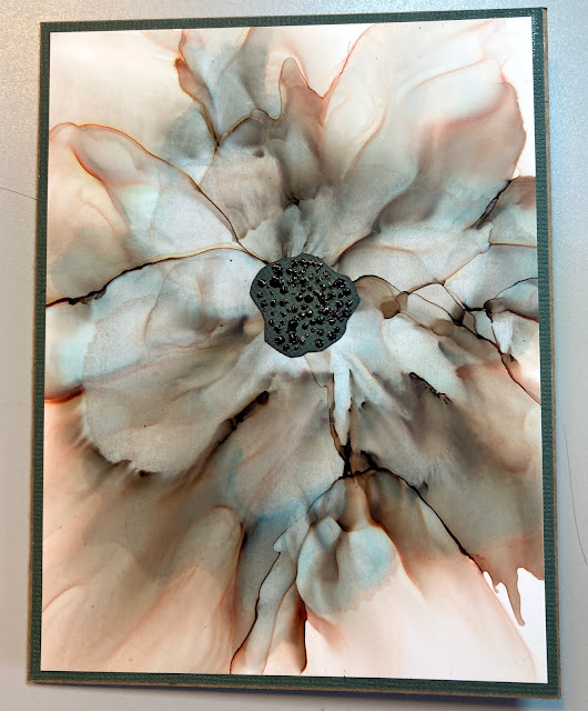
This one was done with just ONE magical color.  Mushroom.  It seems to react with the alcohol differently than with the Alcohol Blending Solution. I doused my Yupo with alcohol then one drop at a time I blew in the direction I hoped for.  When I had a nice blob in the center, I started pouring alcohol on with a dropper with the paper tilted and blew like mad with my bellows-type tool.  I created the center with some textured and distressed paper and added more texture with Scrapbook.com Color Pops.


Same method only also used Alcohol Pearls in Foundry.


Watermelon and Pepper. White Nuvo drops for the center.


Thursday, February 18, 2021

 Inspired by Tim Holtz paper Dolls vintage photos, I decided to use my own photos.


This is my great, great grandmother.  She and her husband immigrated to the United States from Yugoslavia.  I printed the image that is already sepia toned on plan printer paper, taped it to 110lb card stock with double sided sticky tape and cut it out with a Stitched die from Simon Says Stamps then coated with Ranger Distress Glaze. I stamped an image from Stampers Anonymous Tim Holtz "Dearly Departed, the cursive writing. I then stamped the sentiment from Tim Holtz stamp set "The Journey."  Both stamped in Distress Archival ink in the color Black Soot.  

I used a Tim Holtz stencil, I apologize I don't know the name, and scraped some Distress Texture Paste in Crackle randomly.  

I ink blended the mat layer with Tim Holtz Distress Ink in Kitsch Flamingo then glued the panel onto it.  

The rose was made with Tim Holtz Tattered Florals and colored with the Distress inks in Vintage Photo and Kitsch Flamingo.  I attached the tag with a brad and the lace from my stash and then attached the whole thing to a card base ink blended with Vintage Photo.

This is my grandmother picture taken in the late 1930s.  I cut it out with Tim Holtz Sizzix Deckle frame die and did the same with the mat layer. I distressed the edges with Black Soot Distress Ink and attached to black card base.  Flower and pearl from my stash.


This is my favorite. It's my mom playing dress up around 1948.  I used a background that I created when creating mass background and I really didn't like it. I kept it because you never know!


Wednesday, February 17, 2021

 Lucky One


Tim Holtz products used:

Flower Garden CMS215

Shadow Script #1 662684

Tim Holtz Watercolor Paper

Distress Ink used - Aged Mahogany

Distress Oxides used - Well, most of them.


Years ago I created a wall hanging paper pieced "quilt" with this same pattern with Batik fabrics.

For the card, I hand drew the base bowl on some heavy white card stock and used it as a template. I then cut the base bowl and then each bowl part angled at the bottom so they would appear stacked. Using my Ranger Embossing pen, I used a ruler and drew the lines on the bowls and then heat embossed them using WOW Platinum embossing powder.

I freehand drew the little bird and cut him out of some Tim Holtz brown card stock.  After I glued him on, I decided I didn't like the brown so I colored it!  

For the background I used Aged Mahogany only and did the ink smooshing technique.  It's so cold right now that we have our space heaters going and I managed to blow a fuse while trying to dry the wet background.  Fast forward to my husband clicking every single breaker in the house.  This is one that blows out often. You would think the man would label it. I digress! When it was finally dry enough I stamped out the chrysanthemum stamp with my MISTI tool and heat embossed each flower with the same WOW Platinum embossing powder.

I roughed up the edges with the Tim Holtz thread cutter and inked them with a brush and more Aged Mahogany Distress Ink.  I glued all the parts on the panel and glued that to some black card stock.  I then glued that to some Kraft cardstock.  

I cut out the word Lucky with my Sidekick, three times in black and one time in the Tim Holtz Metallic Card Stock in the Jewel Tones. I glued them all together to create some dimension. Let me tell you, stacking those tiny things is a bear! I cut out some chopsticks freehand then added clear heat embossing over them.  I glued those to the bowls and added some amber rhinestones for a finishing touch.  

I winged it with the envelope using a 12x12 sheet of cardstock and heat embossed the same flower with the same embossing powder.

Monday, February 15, 2021

 A Play with some Tim Holtz Ideology stickers, paper, and a charm as well as Impresslits die, Distress Crayon in Walnut Stain and Distress Oxide in Ground Espresso.  The boxes are varied Dollar Tree boxes.


Wednesday, February 10, 2021

Waning Light
Tried to capture pictures, but the light was fading as evening falls.  I will try again on my lunch break tomorrow provided we aren't having thunderstorms as predicted.  It made it to a balmy 72 degrees today here in Alabama. In two days it will be in the 20s.  


 Some of the products used to create this tag.

Tuesday, February 9, 2021

Four Makes today. I am practicing my presentation skills with a home made lightbox.


Monday, February 8, 2021

 To show I know how to stage photos, just haven't had the need. Some of my many makes.  The first one showcasing a product, Reptile Glue. 

The rest just showcase the items.


Colorado Craft 
Big and Bold 
Trinity Shamrock
This card was done with alcohol ink over vinyl.  I have tons of vinyl in my stash from my Cricut and ran out of Yupo.  The ink is from Ranger. It's the Adirondack brand in the colors Cotton Candy, Espresso, and Latte.  I used a lot of 91% Isopropyl alcohol and my blow drying with the cool shot to blow the ink as well as Tim Holtz ink blowing tool.  I stamped part of the background with Catherine Pooler's Love Letters stamp and Vintage Photo Archival ink.  The sentiment is stamped on a blended background of the new Distress Oxide Kitsch Flamingo and Vintage Photo Distress Oxide. I stamped Faith with Ground Espresso Archival ink and heat embossed it and raised it up with some foam tape.  The stamp set can be found at Scrapbook.com.

This one was done by stamping the background with the giant shamrock and ink smudging using several green Distress Oxide inks.  The panel in the center is the Celtic Shamrock Panel from Technique Junkies.  I sure love all of her stamps! 


 This one was with Catherine Pooler Grass Skirt ink and then a dusting of Peeled Paint Distress Oxide.  The background features several shades of green in the Distress Oxides done with the stamp and smudge technique and various stamps from my stash. I fussy cut the shamrock and attached it to the background. The sentiment was stamped and then white embossing over the top.

Homage to Home

 I lived most of my life on the west coast, Northern California and Oregon.  Fire is a part of life there.  The scene here is a frequent scene.  

I designed this card using multiple products.  The moon is a die from a Tonic Studios stamp and die set as are the trees at the bottom.  The houses are from a Tim Holtz die set called Tiny Houses.  All inks used are Tim Holtz Distress Oxides.  

My process was weird because this is not how it started. It simply started with the houses then I closed my eyes and let my emotions wash over, and much like Edwards Scissorhands, I started chopping away!